Bounce Daily
Redesigning the rider experience, from finding a scooter to staying on the road.
A 2-month redesign of the Bounce Daily rider app, making critical journeys clearer for the delivery and gig workers who depend on them every day.
Product Designer

What is it?
Who's it for?
My role
The redesign
A scooter isn't just a vehicle when your income depends on it.
Bounce Daily is a scooter subscription platform used primarily by delivery and gig workers.
For many riders, an unavailable scooter, an expired plan or a failed payment doesn't just mean a frustrating app experience, it can interrupt their workday.
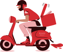
That changed how I approached the redesign.
The goal wasn't simply to make the app look better. It was to make every critical action easier to understand, complete and recover from.
The product worked.
But the experience had grown fragmented.
As the product expanded, new flows and states had been added over time. Individually, many of them worked. Together, they made the rider experience harder to navigate.

The redesign changed how the rider moved through the entire product.


I stopped looking at the app as a collection of features.
And started looking at it as a rider lifecycle.
As the product expanded, new flows and states had been added over time. Individually, many of them worked. Together, they made the rider experience harder to navigate.
DISCOVER
CHOOSE
PAY
VERIFY
RIDE
MANAGE
RENEW
THE PRINCIPLE
Setting expectations before asking riders to commit.
The old experience moved riders into registration quickly, before clearly explaining what completing the journey would involve.


Design decision
From browsing hub names to finding the closest available scooter.
The old experience was organised around the system's understanding of locations: a list of hubs. But riders don't think in hub names. They think, “Where is the closest scooter I can pick up?”

BEFORE
List first discovery
Limited context on map
Rider had to interpret distance & availability manually
The shift
If location drives the decision, the map should drive the experience.

One decision at a time.
Scooter details, plan information and pricing were distributed across different stages of the journey.

How do we help riders compare without making them remember?
We restructured the flow to help riders easily compare scooters, understand plan differences, customise their ride, and review everything before payment.

Design principle used: Don't make users remember information they can compare.
Making the final amount understandable before asking riders to pay.

Money-related screens should remove questions, not create them.
We focused on clarity, hierarchy and transparency to build trust at the final step.


BEYOND THE HAPPY PATH
But the happy path was only part of the product.
What happens when payment fails, KYC is rejected, a scooter sells out, a plan expires, or kilometres run out?
Designing the states between the screens.
A status alone wasn't enough. Every state needed to explain what had happened—and what the rider should do next.
KYC
Not started → Uploading → Submitted → Approved / Rejected → Retry


Plan lifecycle
Active → Expiring → Expired

Kilo-metres
Available → Running low → Exhausted

Switching vehicles without making riders understand the complexity behind it.
Eligibility could depend on scooter category, licence requirements, KYC status and vehicle availability. I turned those dependencies into one guided flow.

Compare → Check eligibility → Complete missing requirements → Find a hub → Switch
Bronze → Silver → Gold

A visual language for moments that needed more than just text.

From functional flows to one connected rider journey.
List-first discovery
Map-first discovery
Fragmented booking
Guided decision-making
Unclear system states
Status + clear next action
Reactive experience
Proactive alerts
Inconsistent patterns
Reusable design system
Transaction-focused
Retention & rewards
A clearer rider journey and a stronger foundation for the product to grow.
Clearer core journey
Better state visibility
Scalable foundation
New retention opportunities
The happy path is only a fraction of the product.
The most important design work often started by asking: What happens if this doesn't work? Payment failure, rejected verification and sold-out scooters weren't secondary screens. For the rider experiencing them, they were the product.
Clarity matters more when the product affects someone's livelihood.
A confusing status wasn't just an interface problem. It could delay a rider's workday. That made explicit states and actionable next steps more important than visual novelty.
A redesign should improve the system, not just the screens.
Reusable patterns for statuses, cards, alerts and bottom sheets made the experience more consistent and gave future product work a stronger foundation.
I started this redesign thinking about how to simplify a scooter rental app. I finished it thinking about how to design around the realities of the people who depend on it every day.